
In the middle of the second wave of the covid-19 pandemic in Portugal, the government introduced new restrictions to movement to prevent the number of cases to increase. The goal was to have less restrictive rules while still being able to stop the virús.
Because this was not a complete lockdown, everyone became a “mobility expert” and commenting on the number of people on the streets became a national sport. But could data shed some light on this topic? And could we use data to show how this confinement was working?
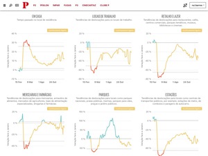
Using Google’s “COVID-19 Community Mobility Reports”, I built a model that relied on rolling averages and standard deviations to establish three levels of confinement to 154 municipalities in Portugal.
This up to date news app created an easy way to let everyone check how where they lived was confining and where they could improve: are people in my municipality going too much to restaurants? Maybe we should stay at home!
I’ve used R and the plumber package to create an API running on a Heroku server to deliver the always up-to-date data. The news app is using vue.js to create the reactive page for all municipalities and chart.js (with a few tweaks) to render the six interactive charts with the three levels of confinement color-coded.