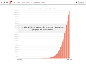
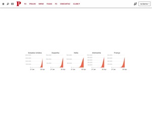
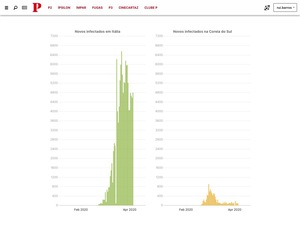
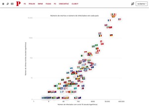
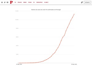
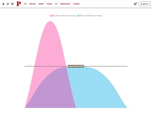
Flattening the curve became probably the most influential and most important chart of 2020. At the beginning of the pandemic, everyone was using that term, but we felt that people didn’t understand why it was so important. That’s why I developed this scrollytelling article where people could understand a little better what that really meant and what the data across the world showed us about it.
Published at PÚBLICO
on
April 5th,
2020
How to flatten the curve? What other countries experiences reveal
Articles
With
Dinis Correia
Technologies Used
R, JavaScript, tidyverse, Chart.js, Scrollama
Topics
Coronavirus, scrollytelling, data visualization