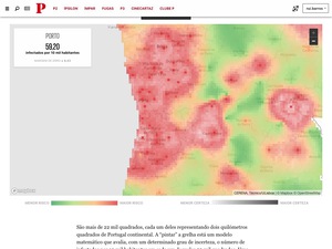
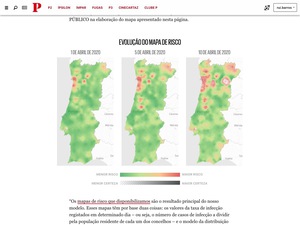
The problem with covid-19 data by county is that it gives the impression that the risk gets higher or lower everytime you change from one county to another.
To tackle this issue, a team from a Portuguese university divided the country into a 2km X 2km grid and calculated the risk associated with that area and the uncertainly of that prevision. After talking with some members of this team, I’ve developed an interactive map that allowed people to check the risk of getting the virus where they lived.
The tool was pretty successful and I kept feeding it new data everytime that team updated their risk maps. But when Portuguese authorities stopped providing local data on daily basis, we needed to stop updating this interactive feature.